
Strategic Audit Solutions
Building a sharper identity for a financial recovery platform ready to scale.
Strategic Audit Solutions helps finance teams recover the money their companies didn't know they were losing — duplicate payments, statement mismatches, vendor fraud, debit errors. Their software has quietly returned hundreds of millions to AP departments at companies most of us have heard of. But after years of building products one at a time, the suite read like five separate vendors instead of one platform. SAS engaged Bossa to give the company the brand architecture its products had already earned.
Year
2025
Duration
2 months
Client
Strategic Audit Solutions
Categories
Brand Strategy · Naming · Visual Identity · Design System
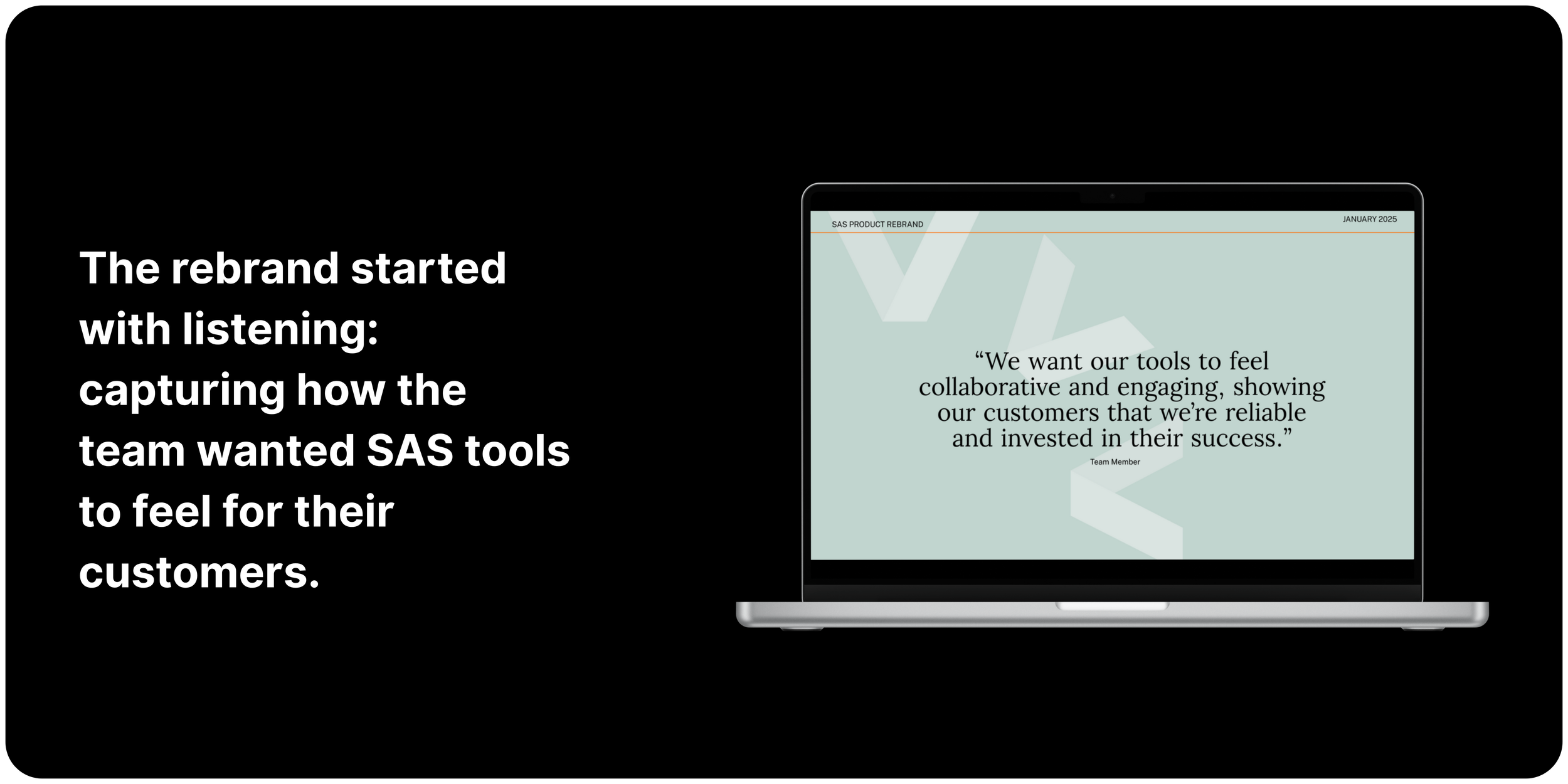
Diagnosing the architecture
SAS's first instinct was a logo refresh. Ours wasn't. After two weeks of stakeholder workshops and sales-call reviews, the real problem surfaced: their reps were burning the first ten minutes of every demo just explaining how five separate products fit together. The brand wasn't tired — the architecture was. The decision became less 'what should this look like' and more 'should these five products be three brands, or one suite with five specialists?' We made the case for the second.
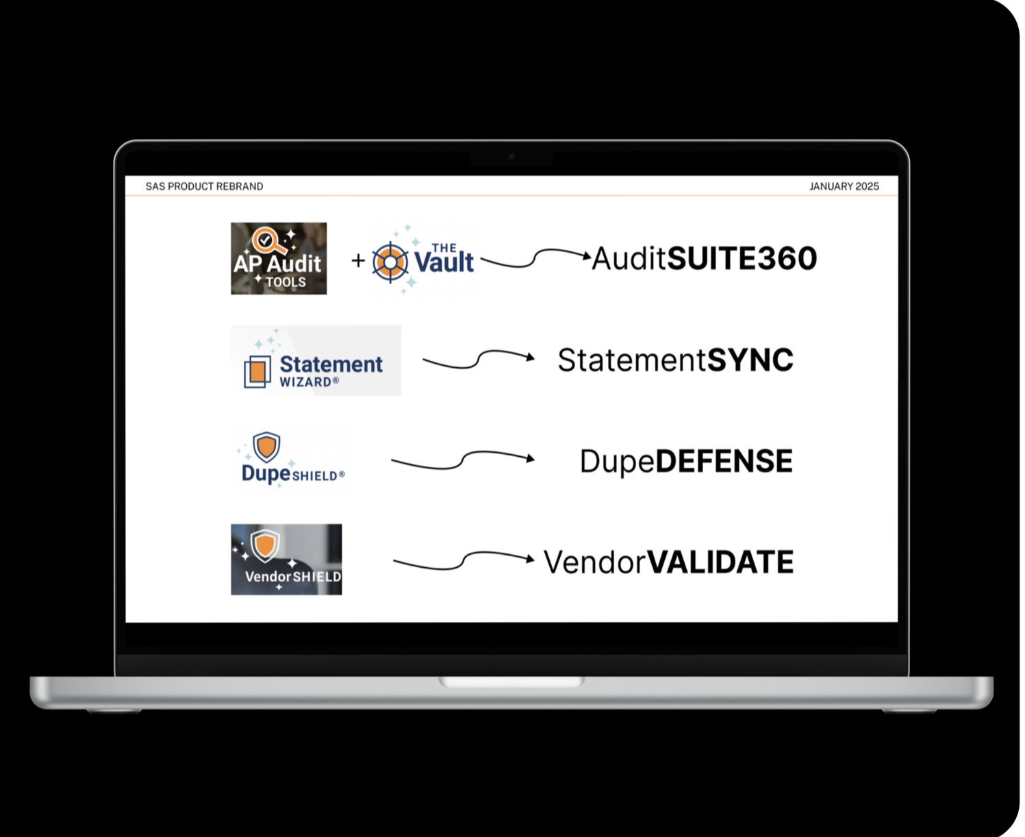
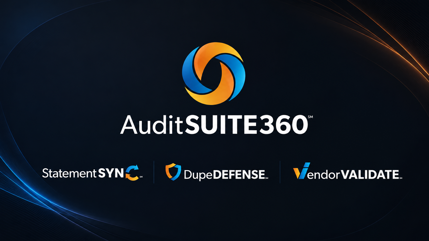
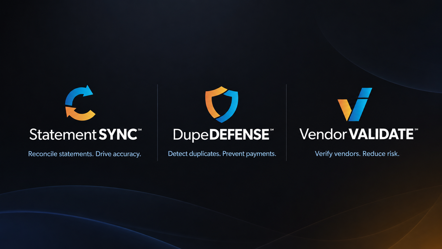
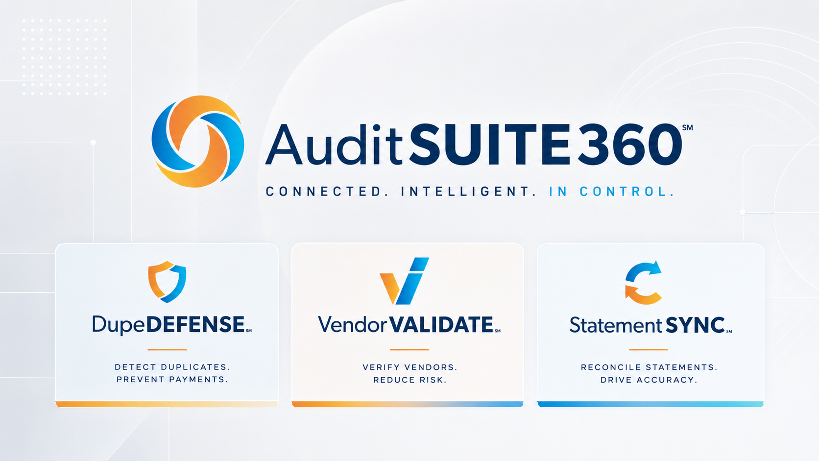
Building one brand, three specialists
AuditSUITE360 collapses three products into a single promise: every dollar your finance team should have caught. Each sub-brand — StatementSYNC, DupeDEFENSE, VendorVALIDATE — earns its distinction by function, not by visual novelty. The naming system gives the sales team a single sentence to open every demo: 'AuditSUITE360 is the platform. Here's the specialist for your problem.' That's a shorter sentence than the one they were using before. That was the point.
Designing the system to scale
The visual identity had to do two contradictory things at once: feel modern enough to compete with fintech-native challengers, and feel sober enough that a CFO would trust it with $40M in disputed AP.
We landed on a system built around a precise wordmark, a restrained color palette anchored in deep blue with a single accent color per sub-brand, and a typographic hierarchy designed to survive dense dashboard UI without losing brand presence. The system was built component-first in Figma — a single token change propagates across every product surface.

The result was a brand system that gave SAS more than a new look. It gave the team a clearer way to explain the product suite, a stronger foundation for sales conversations, and a more credible presence in a competitive financial recovery market.
“We engaged Niley to assist with our product rebranding initiative and we couldn’t have been more pleased! She listened to our goals and product strategy, considered our company culture and desired emotion, and the results were spot-on. The thoughtfulness and creativity she brought to our project was exactly what we needed. I can’t recommend her more highly!”